
Falta.
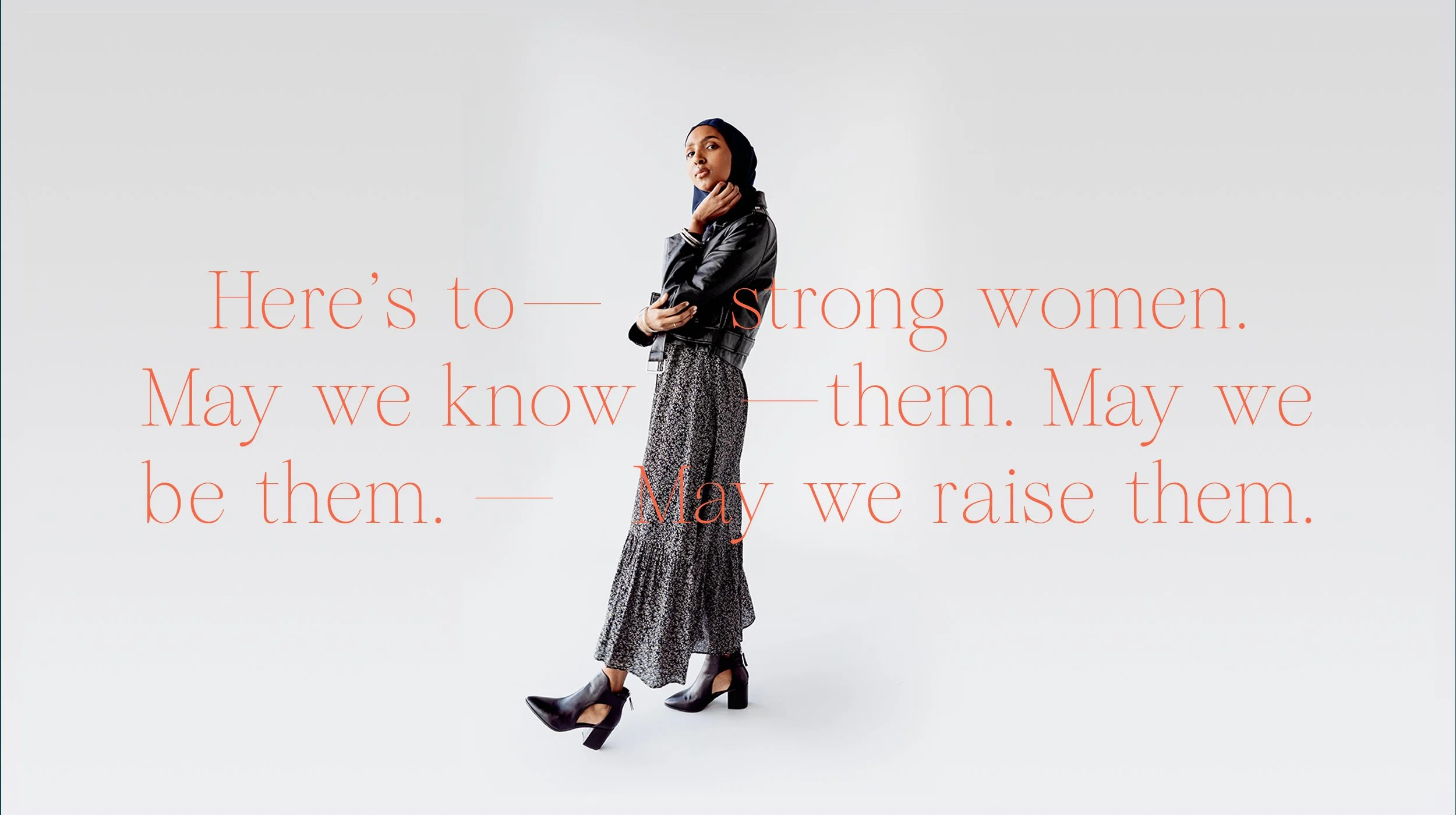
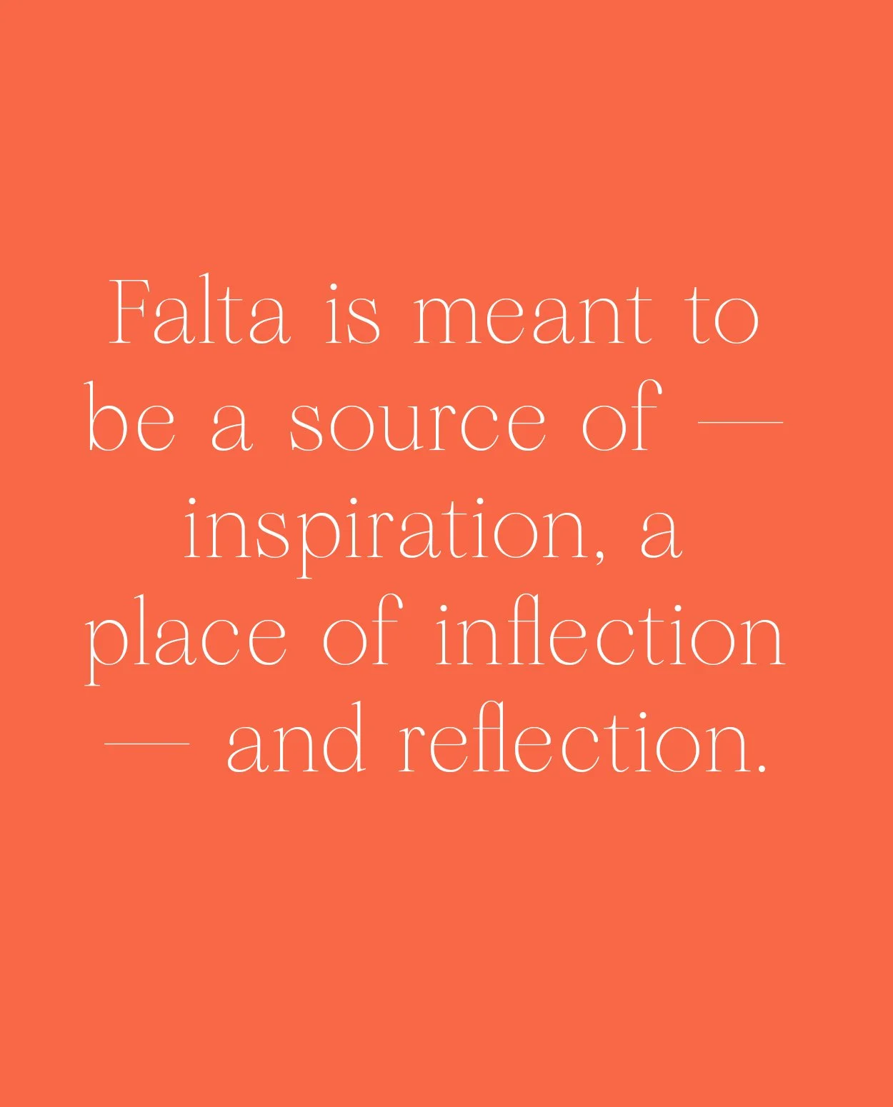
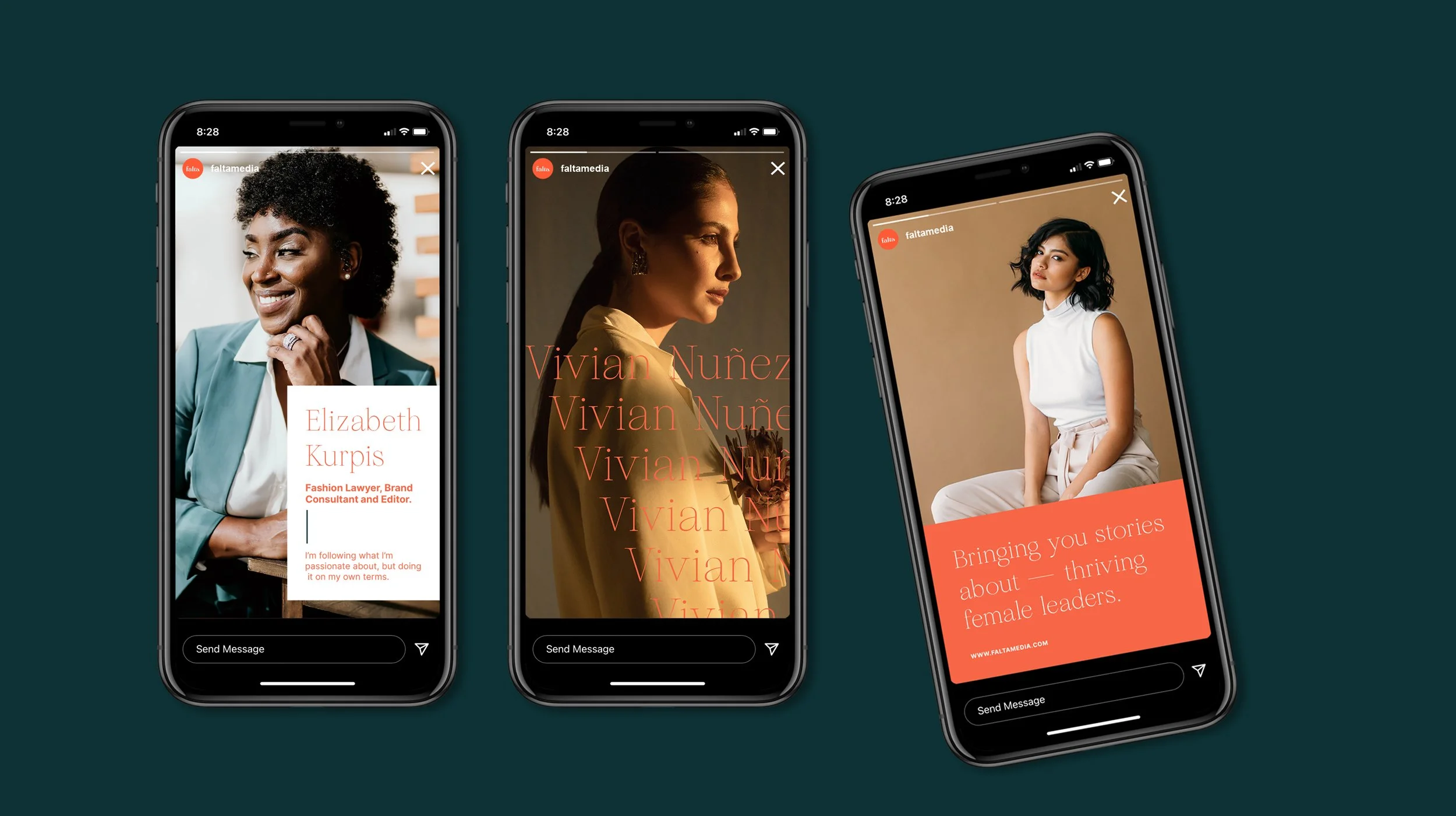
I just recently had the pleasure of working with falta media which is an upcoming platform dedicated to bringing you stories about thriving female leaders in the business world. It’s goal is to inspire, and shine a light on all those amazing women who are killing it in different industries, but don’t get the recognition they deserve. That whole mission was actually the inspiration behind the name, falta, which means “lacking” or “missing” in Spanish, and it was chosen to highlight the fact that as Latino women we are currently missing representation, and that there are many stories from amazing women that are simply just missing from the mainstream media.
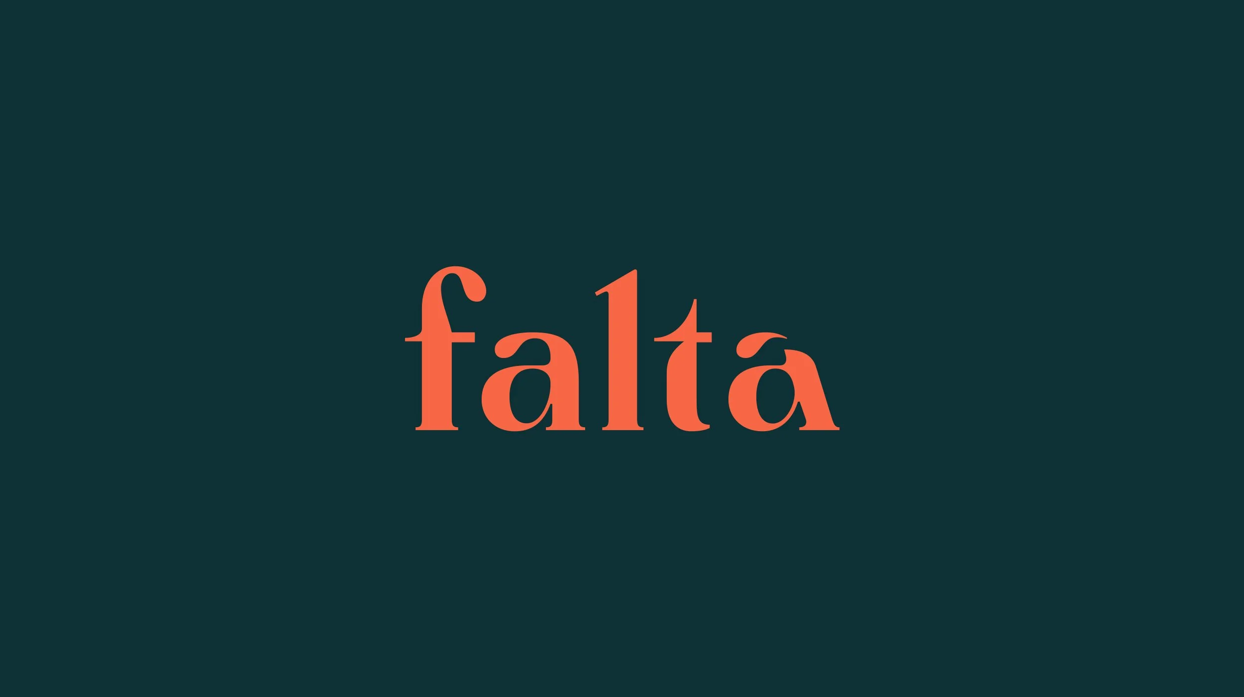
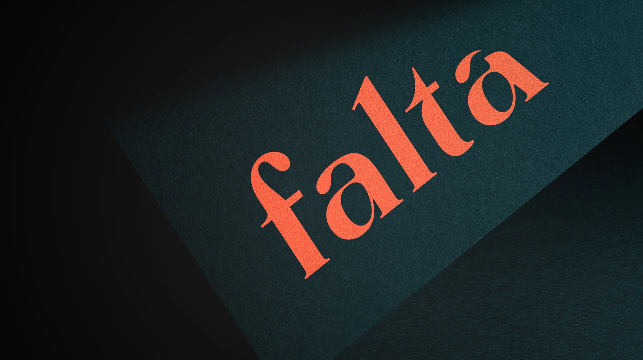
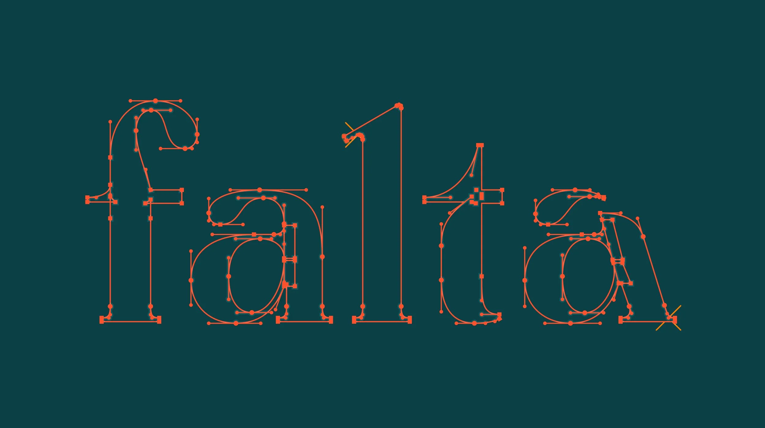
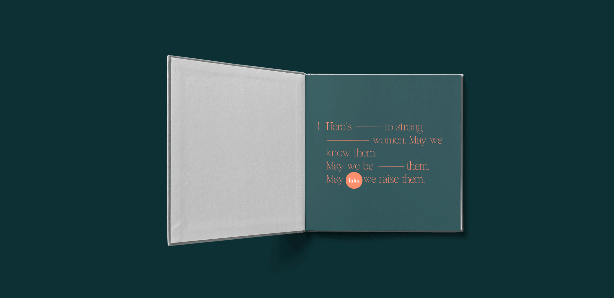
I took this basic concept behind the brand, and used it for the logotype design; which is a reinterpretation of a classic style letterform with tiny bits that are missing and help remind you that there are many women who deserve a seat at the table and whose stories deserve to be told. The visual identity for Falta consists of a bright and vibrant color palette to showcase diversity, and two complimentary typefaces that perform extremely well in digital environments, which is where Falta takes place the most. The identity also includes a simple, yet easy to recognize, typographic system that uses em-dashes to emphasize certain words, and also help highlight certain areas where words are missing. It is a simple detail that helps bring the visual communication together, and that is really easy to replicate by the Falta team.

What: Custom Wordmark + Visual Identity
Where: Los Angeles, CA.
Client: Falta