
Quetz is an upcoming skincare brand with a strong heritage and proud of its mexican roots. Their formulas are inspired by nature’s most high-performance ingredients, such as chia, nopal, agave, prickly pear, and aloe, and their products are created following traditional hand-crafted processes. Quetz aims to become a staple line of skincare products based on two ideals: sustainability and performance.
Quetz.
What: Custom Wordmark + Visual Identity | Where: Guadalajara, Jalisco, MX. | Client: Quetz
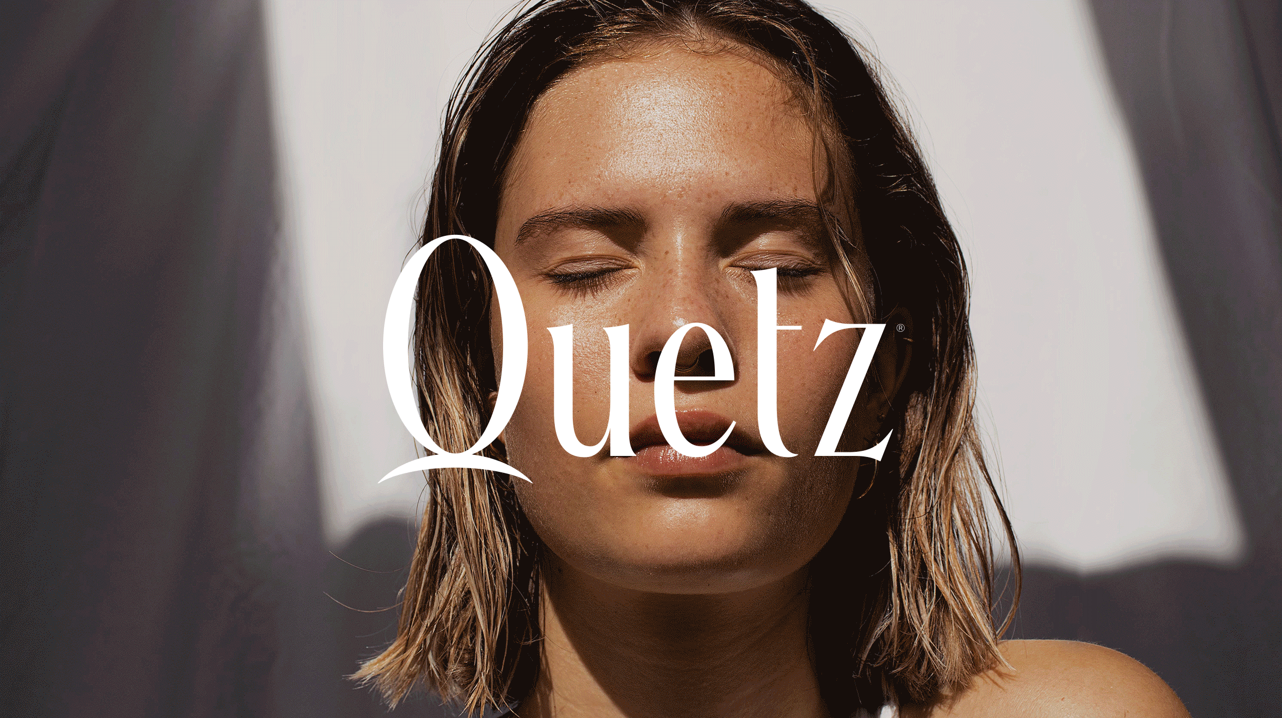
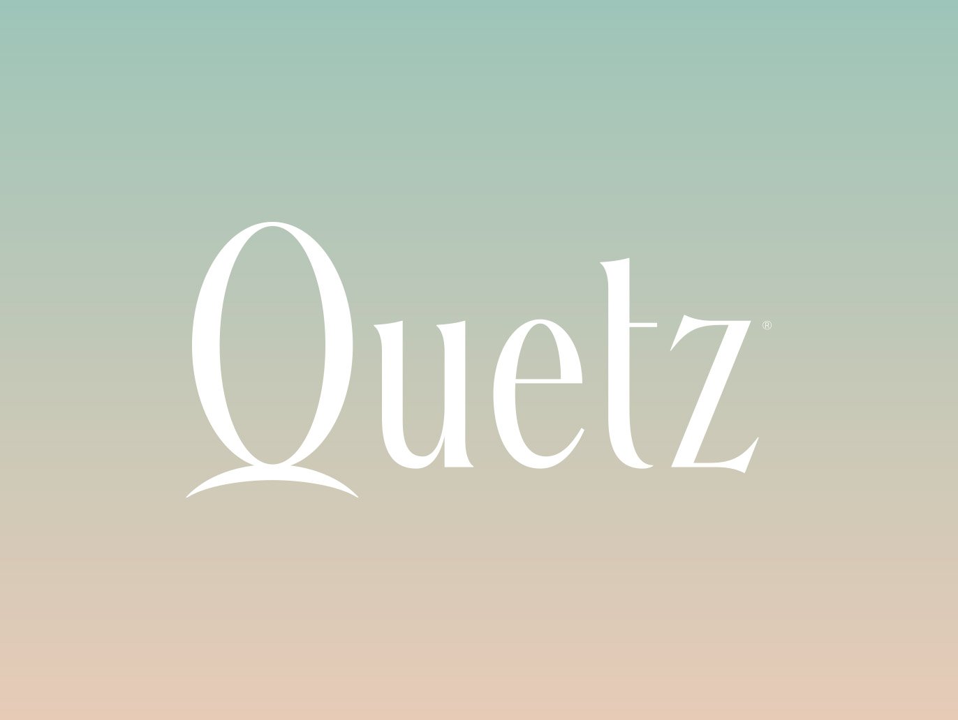
Quetz’s visual identity is inspired by the colors in Mexico’s stunning sunrises, using this as a metaphor for relaxation and the fresh sensation of a new day. Quetz’s wordmark was constructed based on a custom lettering piece of serif letterforms with a generous x-height, high contrast, and elegant and stylized shapes to highlight the luxury experience and high-end quality of the products. Quetz’s icon, the letter Q, is based on a rising sun behind a hill, accentuating its main concept.

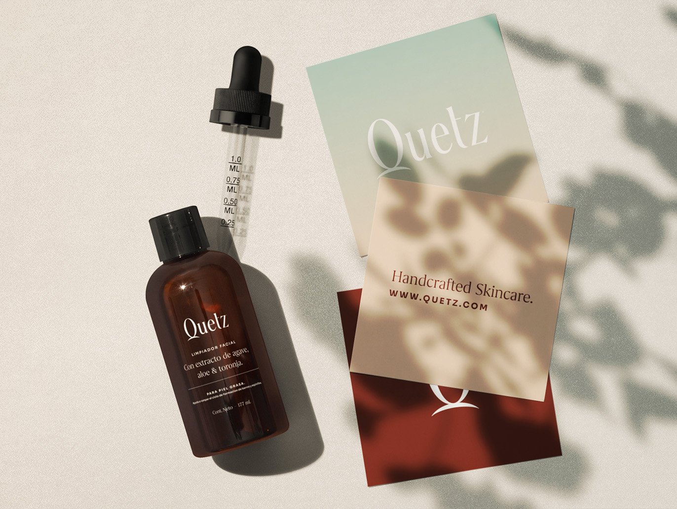


Besides the logotype and icon, the project consisted establishing a typographic hierarchy, and color palette, which included a primary and secondary palettes to allow the brand to have a more interesting play, both of which would guide the packaging system and labels design for their products.

In terms of color, a primary palette was developed for the brand, which included nude colors and a contrasting hue resembling the natural tone of clay to balance the palette. These initial colors were then combined with a secondary color palette to create a set of gradients based on the morning sky, to highlight a sensation of relaxation and calm. These series of gradients are used in the packaging and labeling system of some products, particularly in the seasonal products that consist of different ingredients, just as the sky changes its colors depending on the season.