
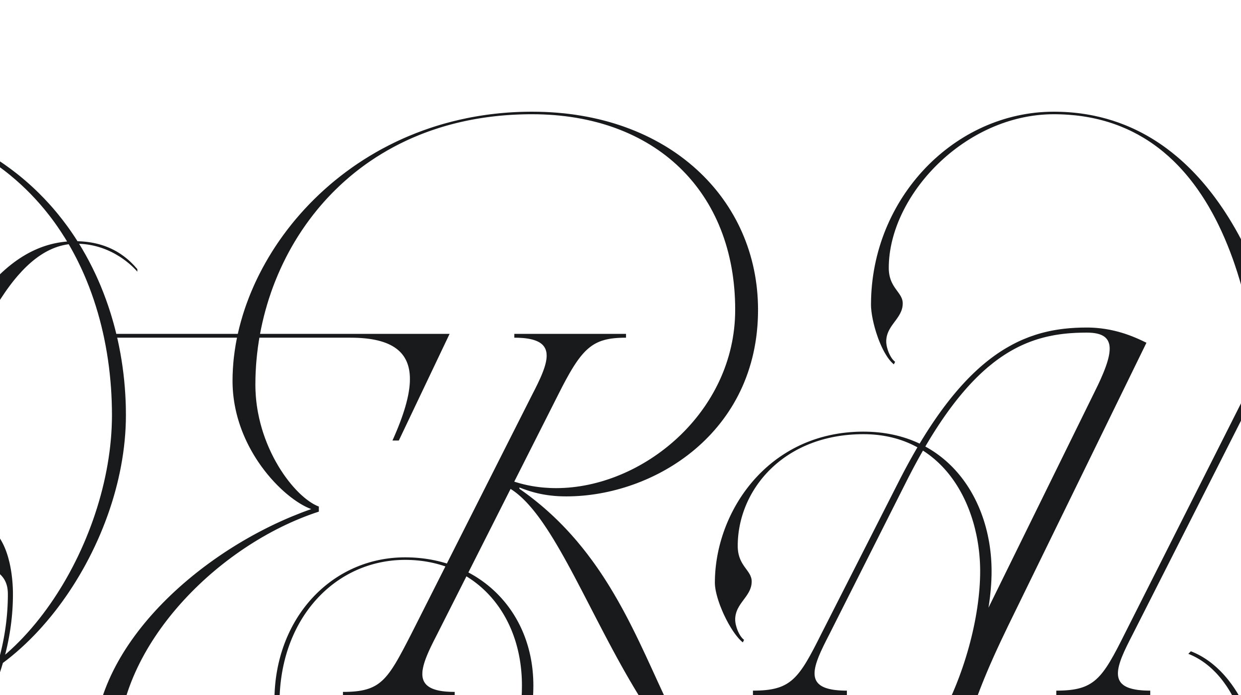
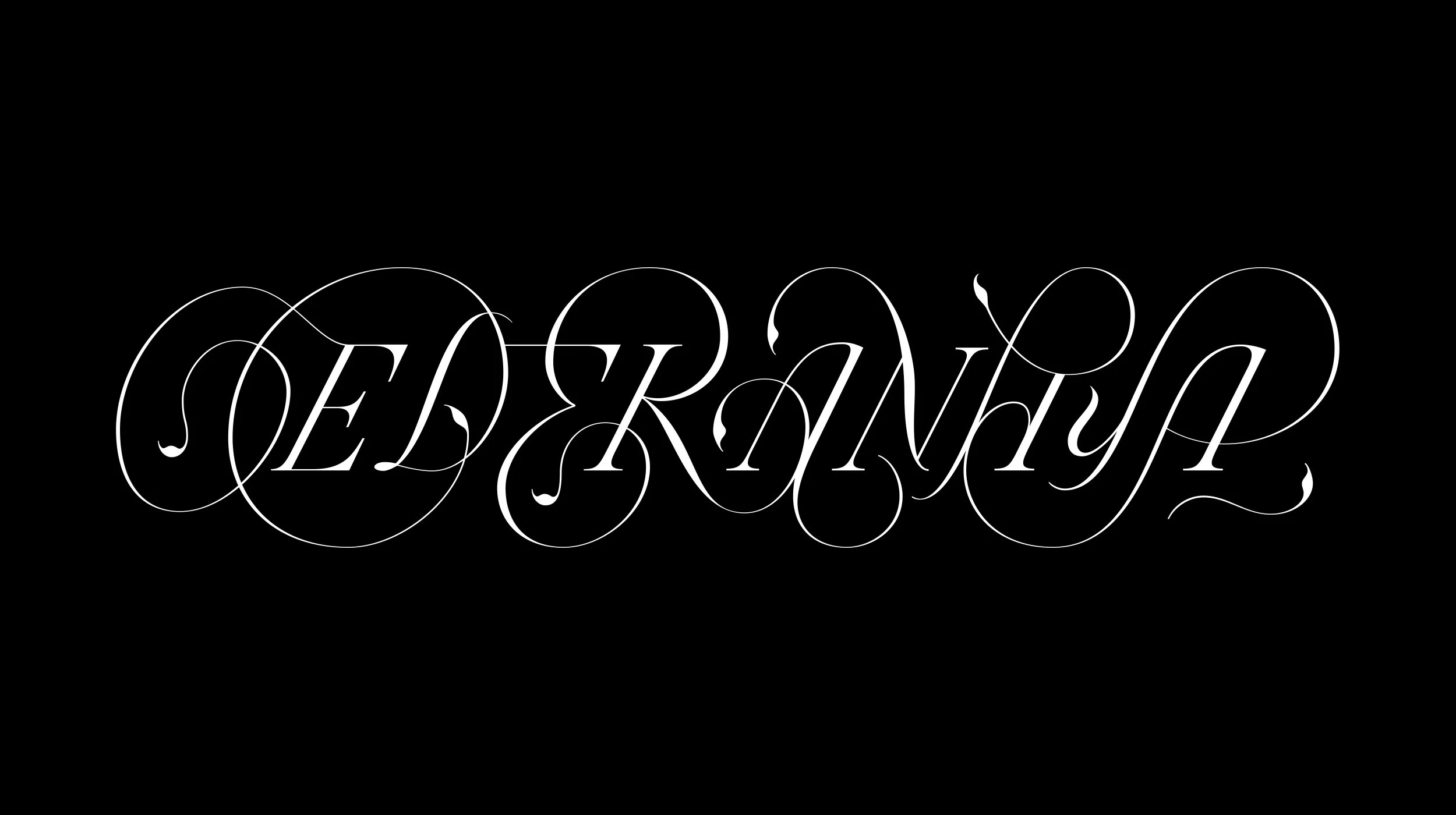
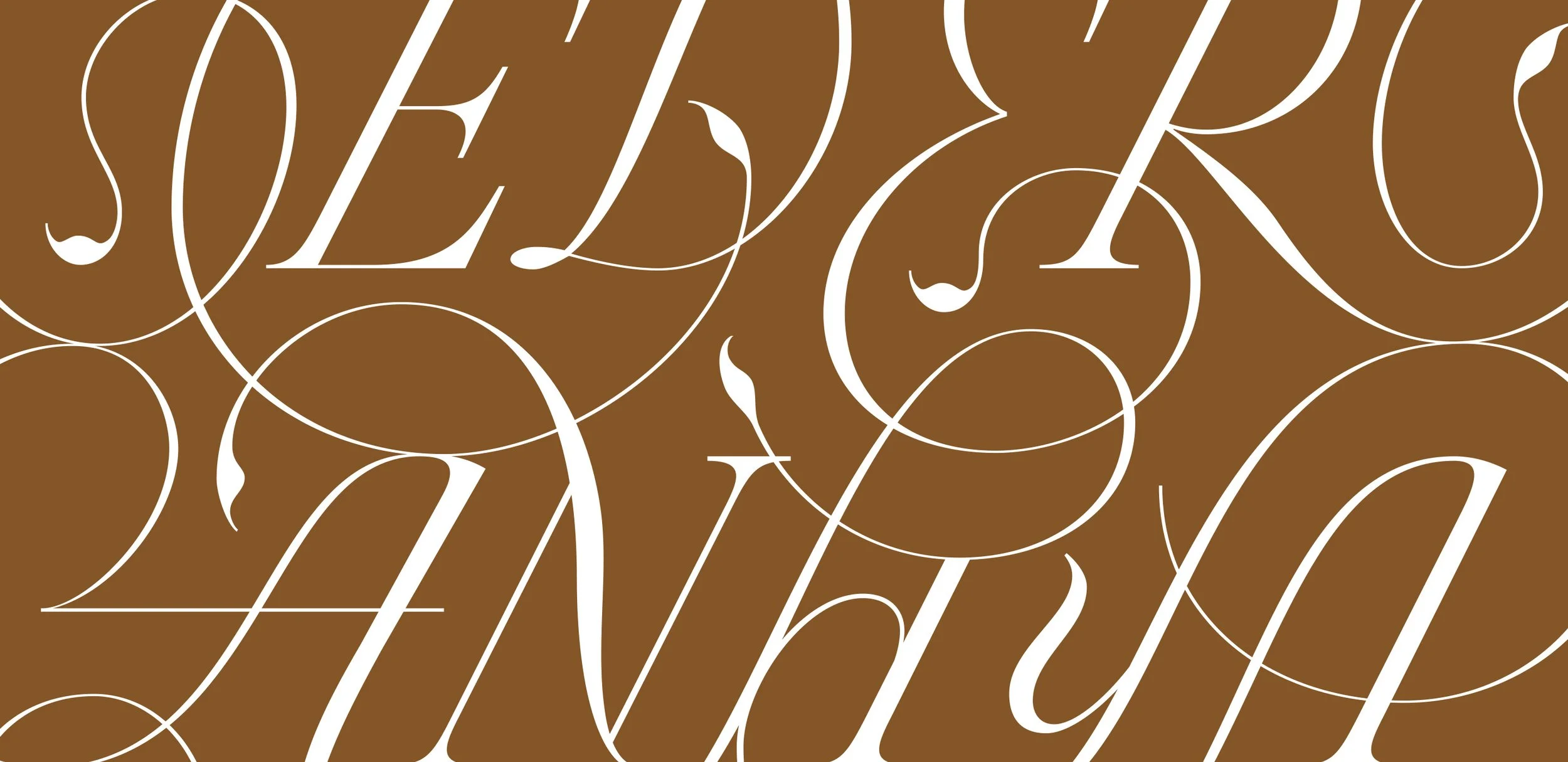
Eder Anaya; the penmanship of the late 17 and 18th century, brought to the screen age.
What: Custom Logotype
Where: Mexico City, MX.
Client: Eder Anaya
Eder Anaya is undoubtedly one of the best interactive art directors & designers from Mexico, and I was extremely happy to collaborate with him in creating his new wordmark for his freelance practice and web refresh.
From the get go, Eder and I got along and bonded over our love for design, typography and Mexico, and needless to say, that bond became the foundation for the whole process: a very organic collaboration where ideas were thrown back and forth until we were both happy and super excited with the piece we were creating.
Eder had a vision of creating a slightly experimental logotype; Something that if needed, would put legibility to the side in order to accommodate more interesting letterforms, shapes, flourishes and ligatures, to become a typographic stain that would be interpreted as a shape instead of as letterforms. Clearly, this was an interesting but also overwhelming challenge.
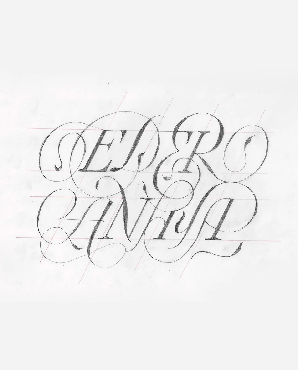
We started looking for contemporary references, and even though we found some really great pieces, the inspiration for this task ended up coming from the past: more specifically in the penmanship of the late 17 and 18th century, when showcasing your pen skills was all the rage and calligraphers were pushing the limits of letterforms and flourishes trying to show that they were the best in their region. And just like them, my goal was to create a piece that would be a symbol of the care and craft behind Eder’s work; a piece with intricate ornaments and curves to reflect the same attention to detail Eder puts into his projects.
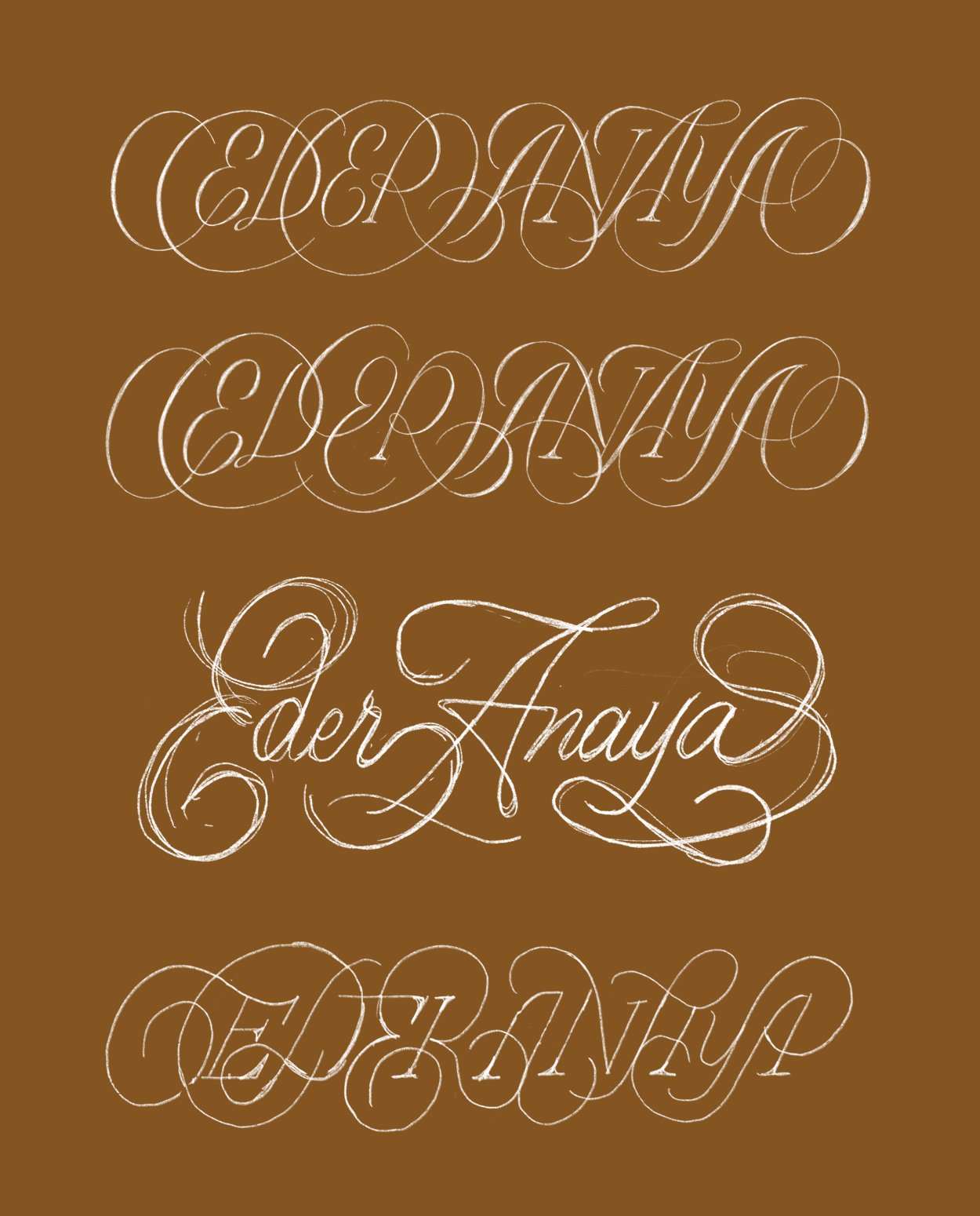
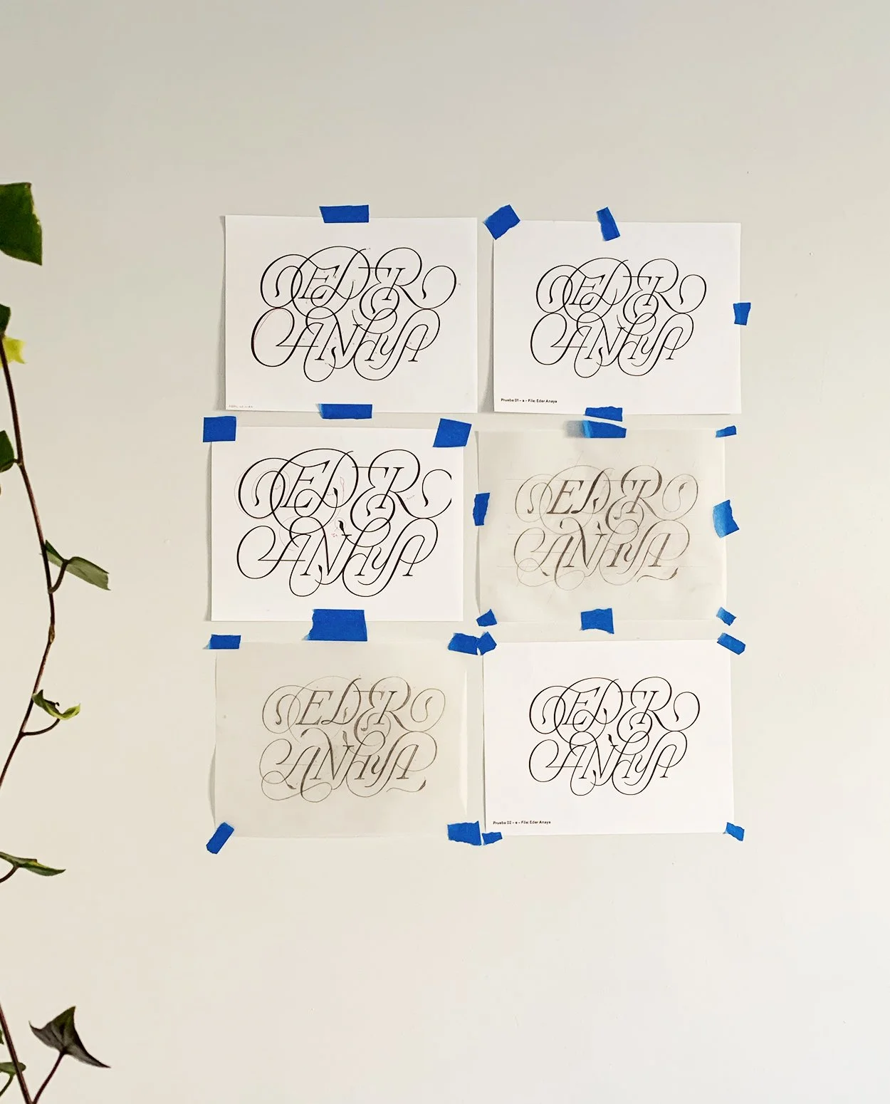
The process started gathering calligraphy samples, and then I moved to several sketches. Some of them were a bit more intricate than others, but once I found the basic layout I moved to a more refined sketch and then what seemed to be a never ending proofing process where I took care of the curves fluidity, the thick and thin contrast and the small details in the flourishes.

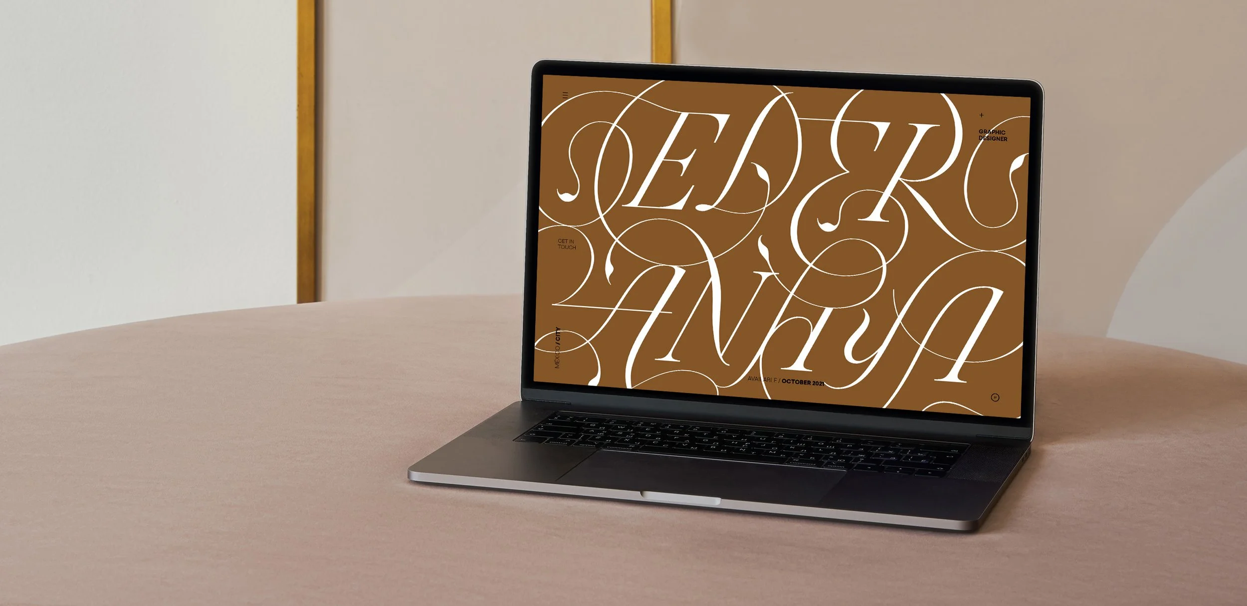
The result is a slightly responsive piece that works at 1 and 2 lines and that borrows from earlier centuries, but that has been adapted to a more contemporary environment where stroke widths and screen resolutions are the new rage.

