Apache XLR.
What: Custom Logotype + Visual Identity
Where: Atlanta, Georgia
Client: Apache XLR
Design Collab with: Dann Torres
APACHE XLR is the authentic and original dinner and show experience in Atlanta, combining a quality contemporary southern dining experience with live entertainment. Opened for business in 2001, over the past twenty years Apache has created enormous opportunities for local, regional, national and even international musicians, DJs, and artists. It has provided a performance stage and marketing for these artists to hone and capitalize on their craft, as well as curated, commissioned, and inspired the arts community to push its development and production quality.
After many years in the business, it was time for Apache to go through a brand refresh, and given that Apache brings together not just any live musician and any type of food but prioritizes nurturing the finest local musicians and most delicious modern southern fare to be found, this redesign needed to be a delicate balance between a contemporary and a sophisticated look & feel.

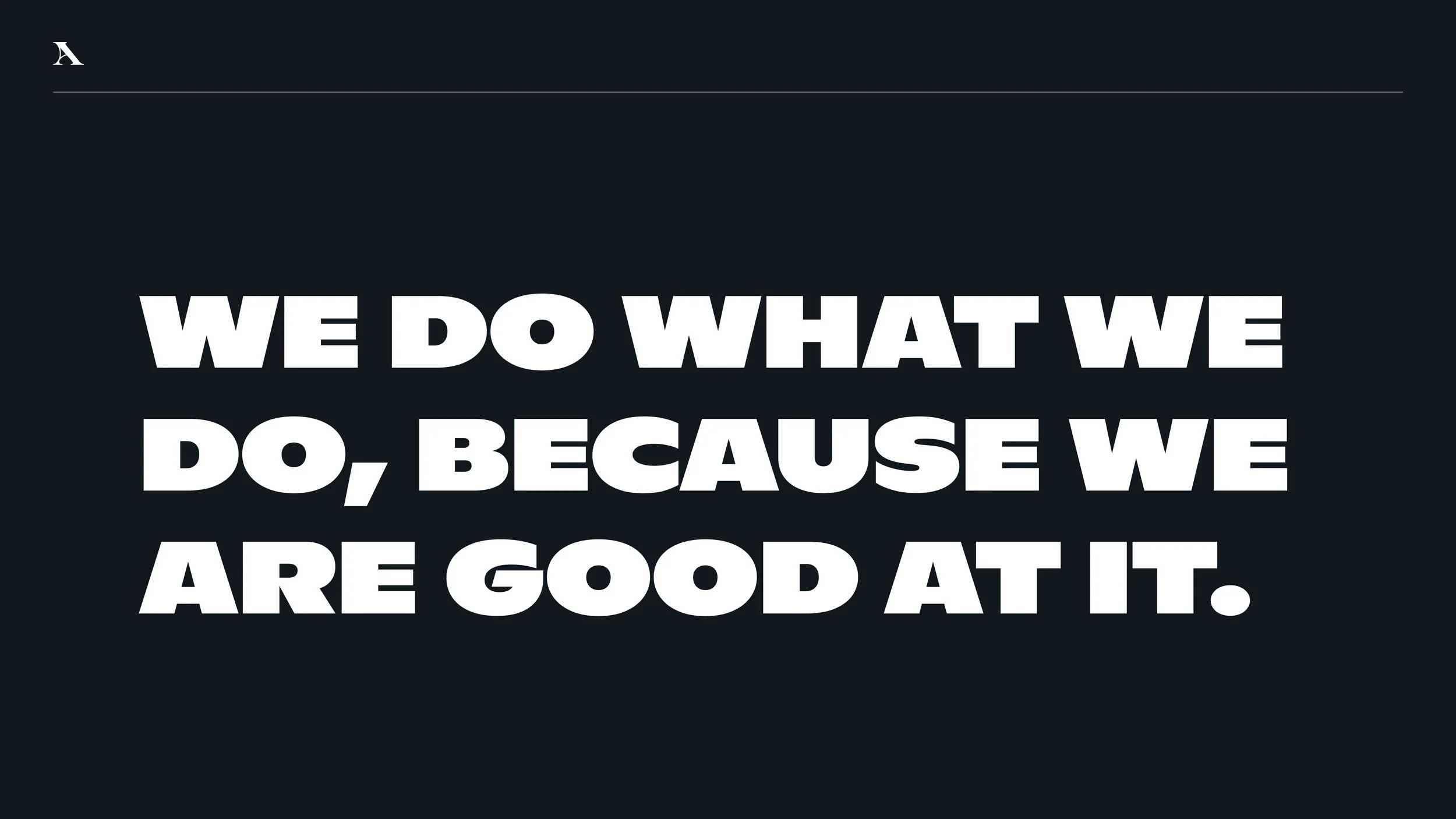
The starting point for inspiration was the name: Apache XLR. While the XLR part is some sort of mystery, the word Apache was carefully chosen by its founder as a homage to his history and background: First, from the Native American tribes in the Southwestern United States, as the owner’s family are from Arizona, which historically, is one of the Apache homelands. On the other side, the Parisian underground art group called Les Apaches, was also a source of creative stimulus. Les Apaches (or Société des Apaches) was a group of musicians, writers and artists which formed in Paris, France in 1903. Initially, the term Les Apaches was used to describe European street gangs, but was later adopted by many creatives who found the name amusing, especially as they saw art as being at odds with conservative tastes. The term was then also used to describe La Danse Apache, a highly dramatic dance associated in popular culture with Parisian street culture at the beginning of the 20th century. All these different ideas help conceive the main concept behind Apache’s new branding system. One where energy, rebelliousness, and underground creativity serve as a guide for the full visual identity.
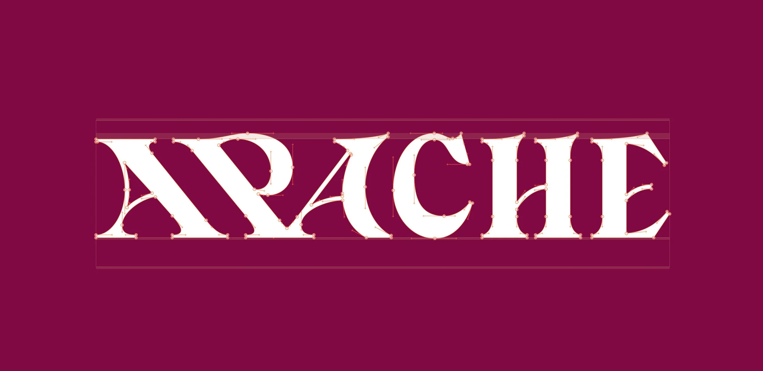
From selected sketch to digitized piece:
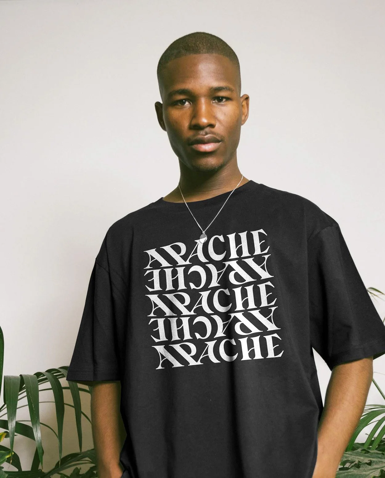
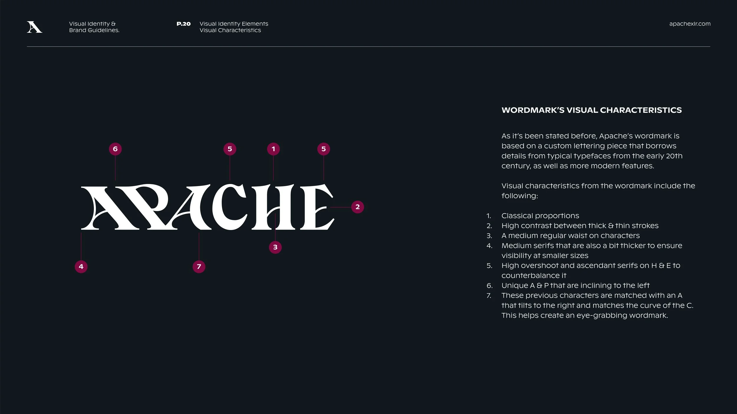
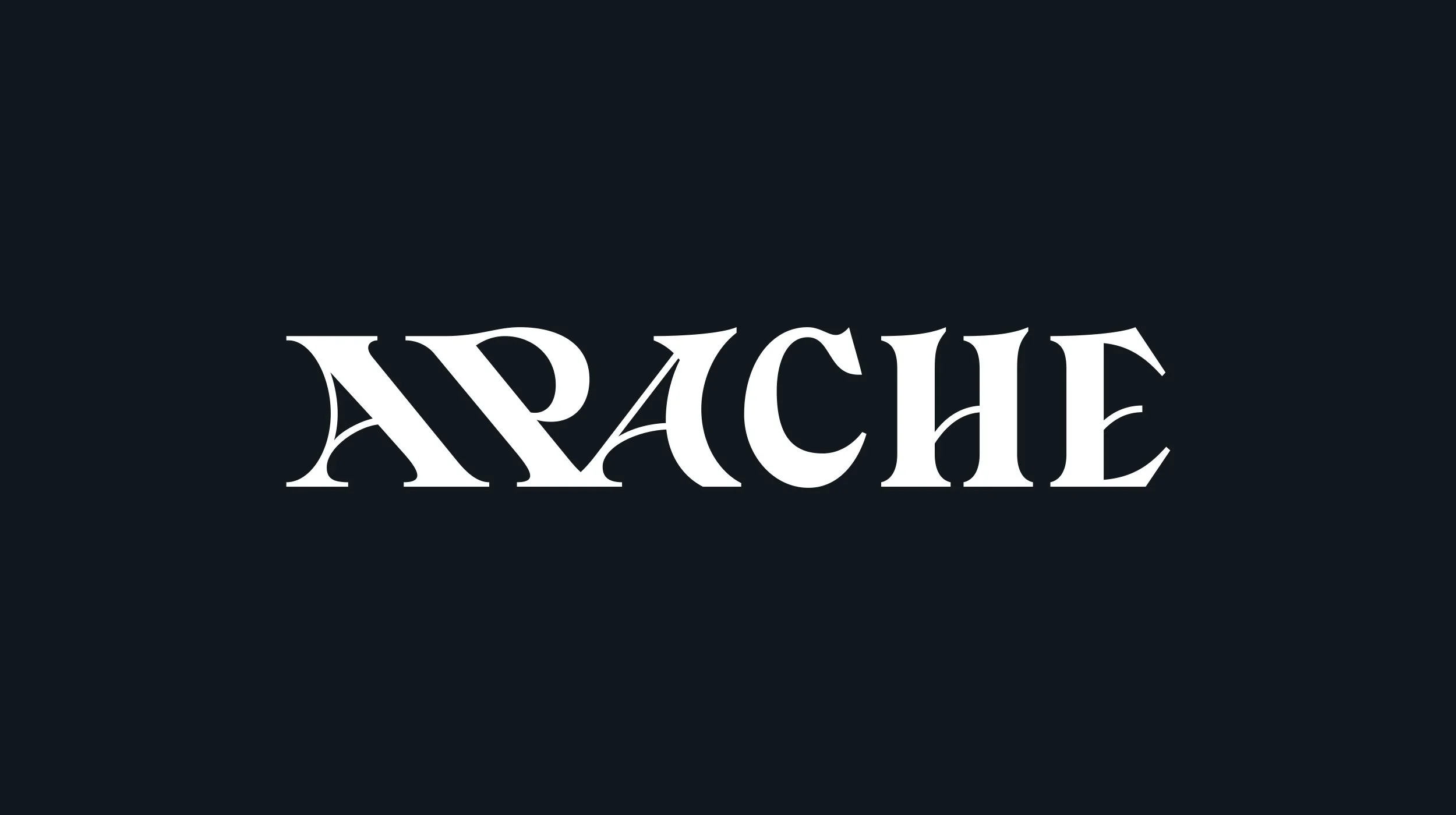
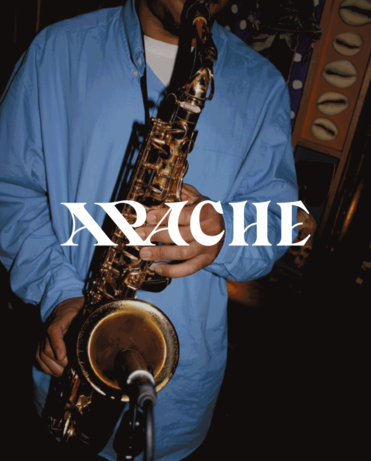
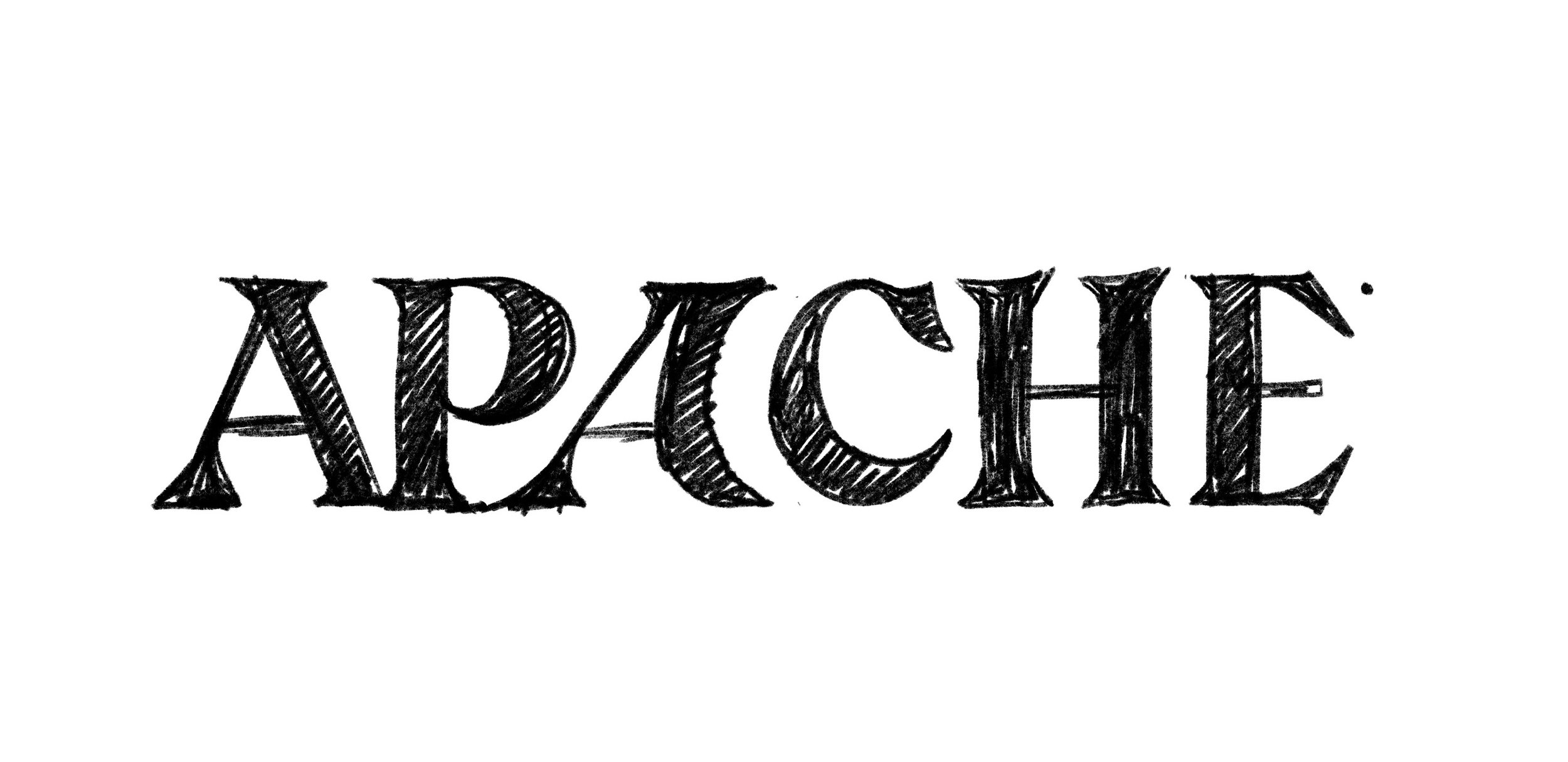
As it’s been stated before, Apache’s wordmark is based on a custom lettering piece that borrows details from typical typefaces from the early 20th century, as well as more modern features.
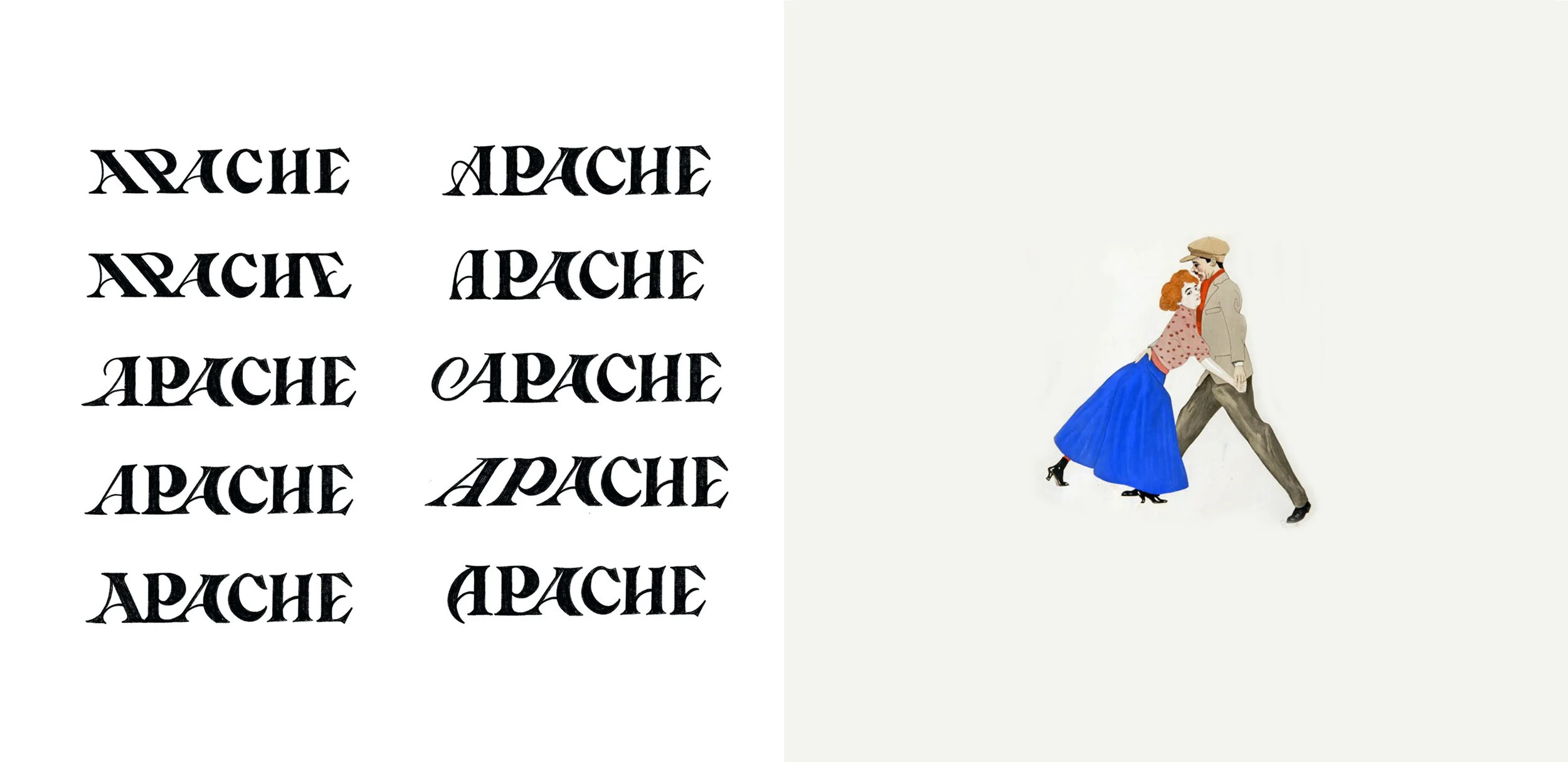
Iteration process & inspiration behind these sketches:
We chose to focus on this highly energetic and dramatic dance to visually represent Apache’s new wordmark. This way, we would be able to create unique letterforms that seem to dance and move and create a much more unique wordmark, but also convey this rebellious spirit and high energy that can also be found in Apache, which as we’ve established before is a venue that seeks to deliver a high quality combination of entertainment, food, and creative energy.
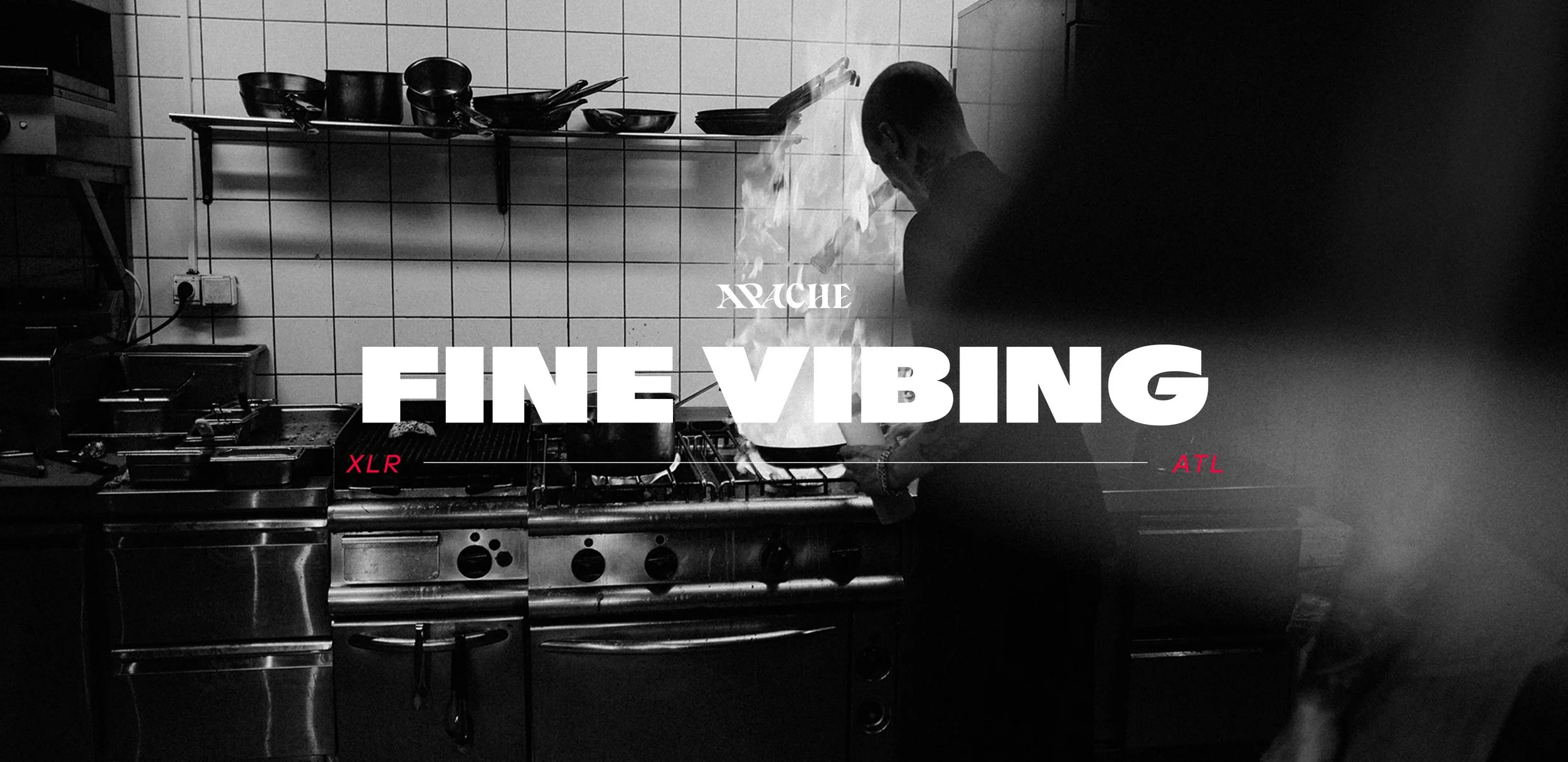
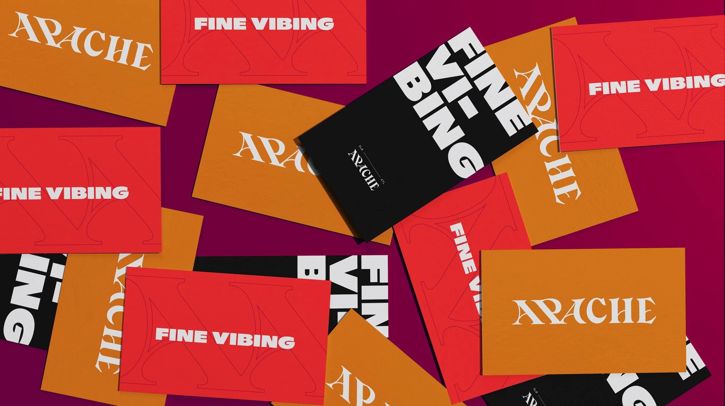
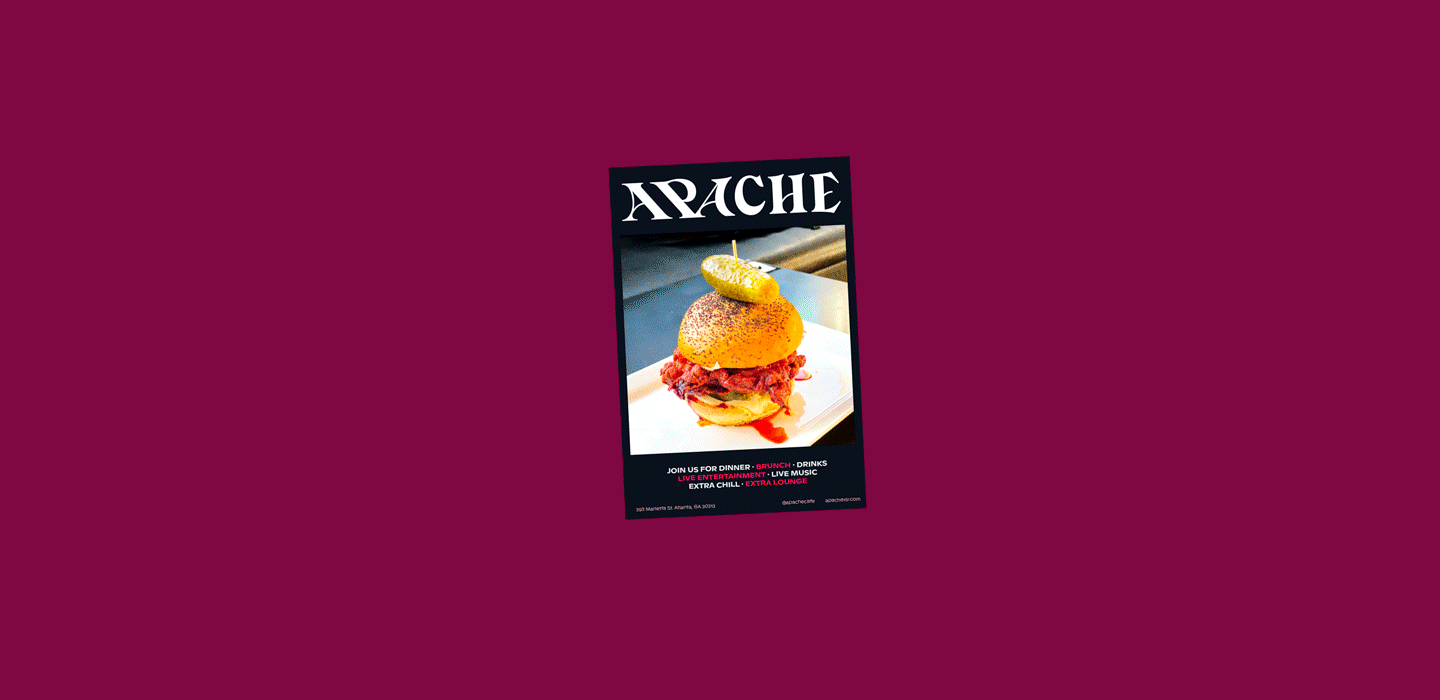
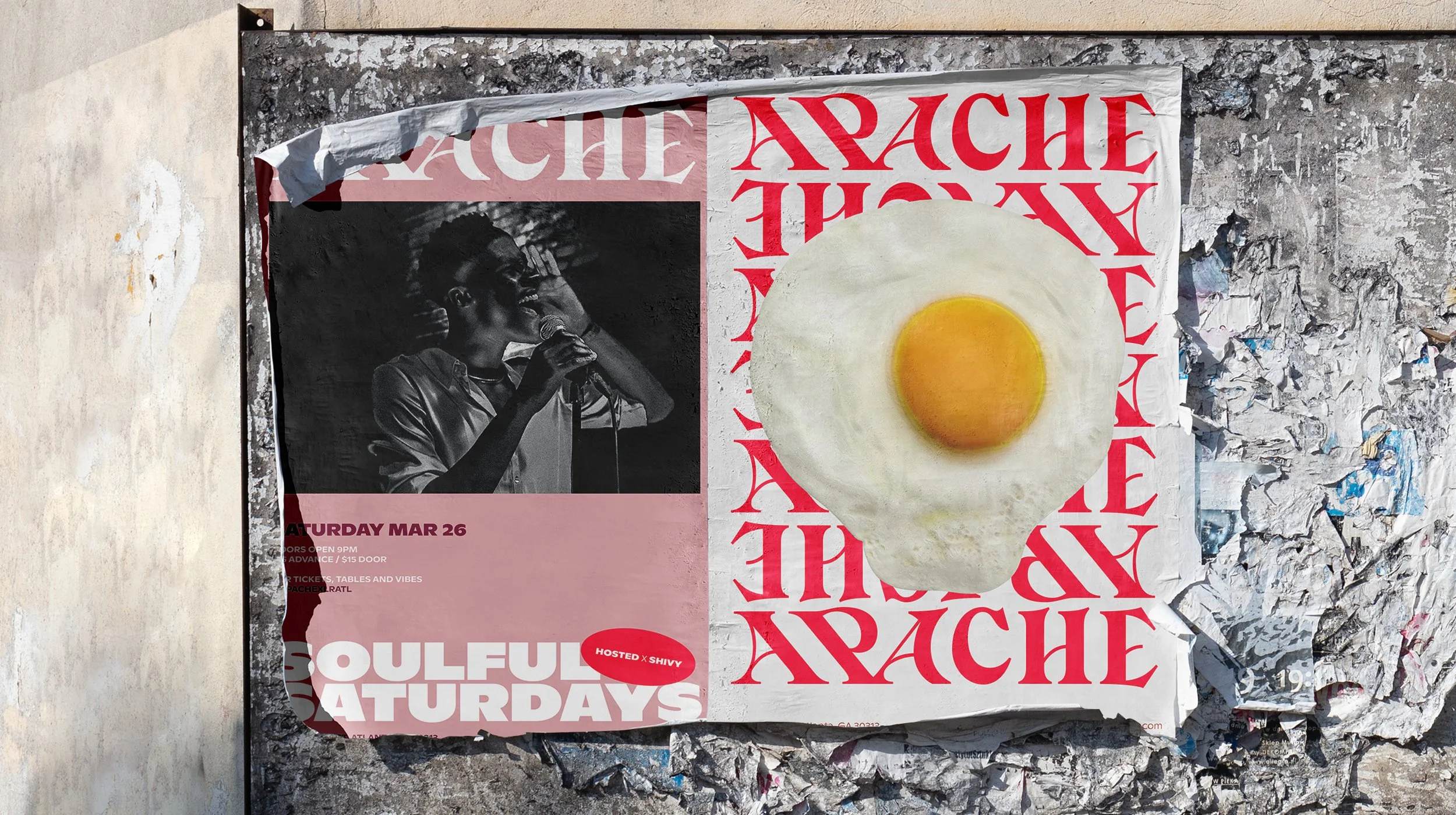
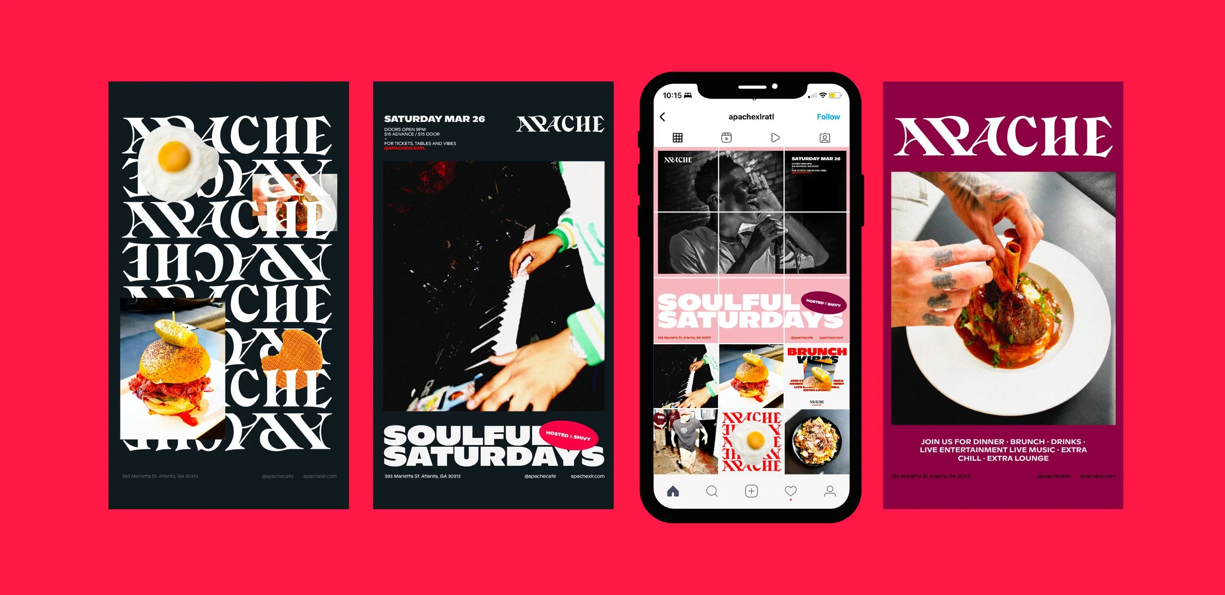
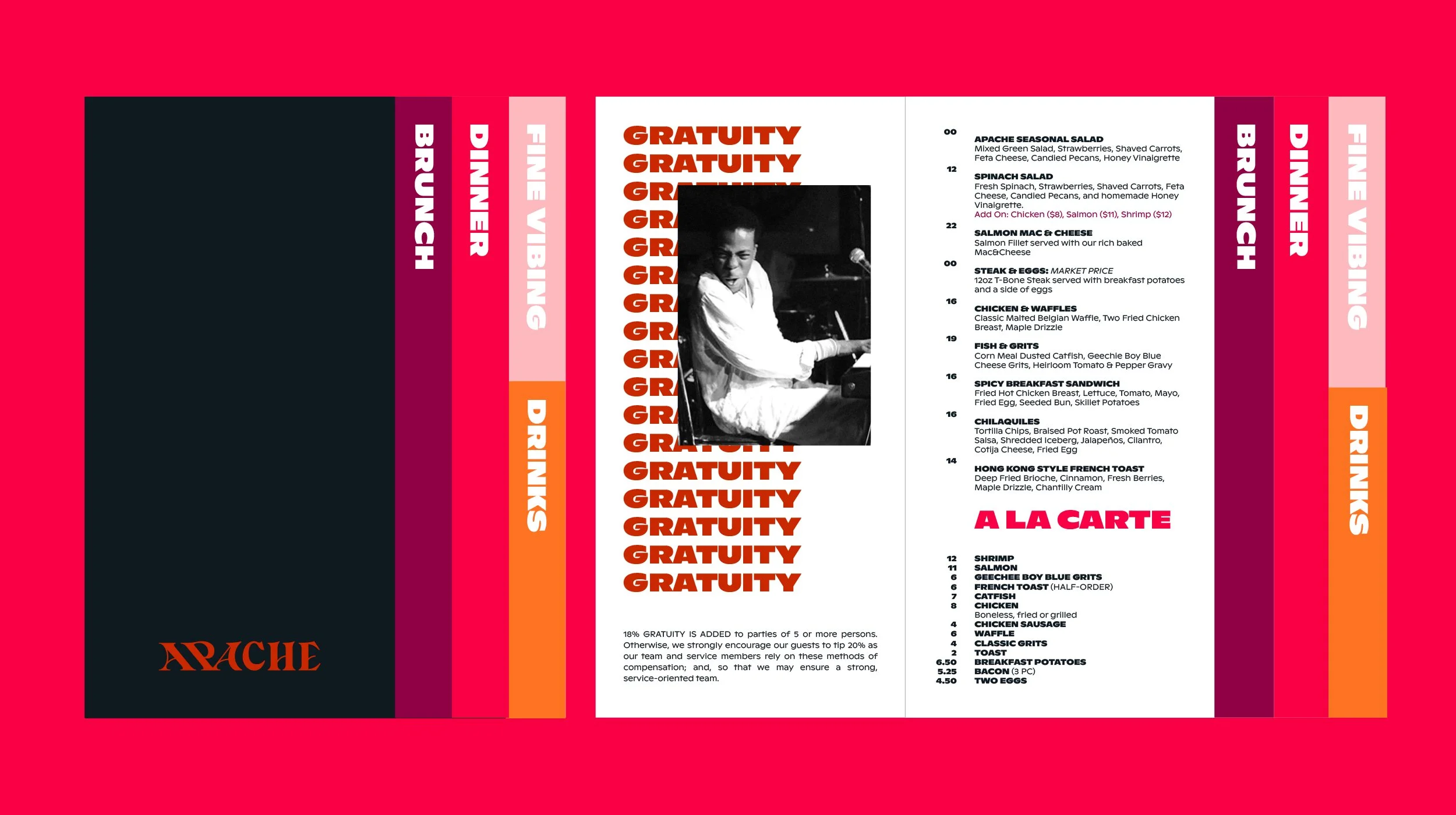
After tackling the logo, we moved forward to developing the visual identity system that would aid Apache in all of its external communications. The foundation was a series of guidelines that would lead the way & conduct the development and iteration of all assets. From the basic stationery including business cards for the founders, to the menu, uniforms, posters, social media templates, and a proposed new tagline with its accompanying type lockups. Apache’s visual identity is a robust system that encompasses different pieces of collateral to help Apache reach their goals of this re-brand.